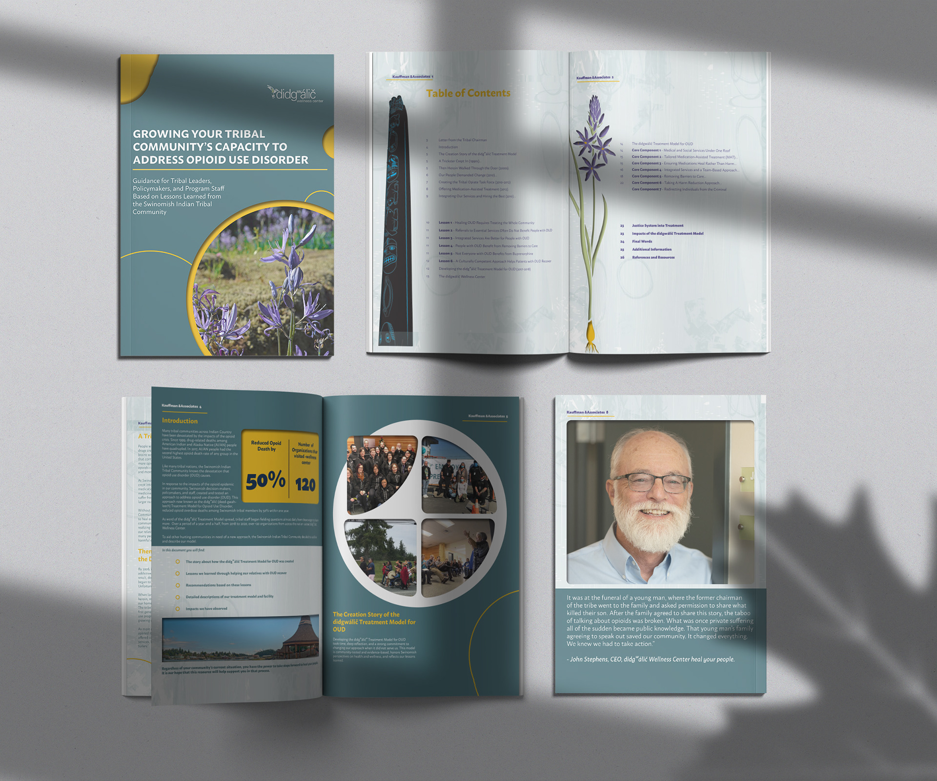
This is a layout design for Kauffman and Associates. They gave me their Impact report in a Word document and asked me to make the document more appealing before they sent out copies to their supporters. I was not given a brand guide but they did send me the color schemes that they wanted me to utilize in the layout. Out of the six colors that were given to me I chose the turquoise color to be a predominant color in the design. Turquoise emphasizes themes such as therapy and healing. It was a great way to set the mood for the topic of the Impact report. The background on the pages was created in Adobe Photoshop with an assortment of different brushes to create an abstract pattern and the shapes are my personal flair that I put in to add depth to the composition.